
Budgeting app that helps you achieve your financial goals.
FreshBread
Overview
FreshBread, is budgeting mobile app designed to help persons reach their financial goals.
Role: I worked on this project as the Lead Product Designer. My responsibilities included:
UX Researcher (flows and persona)
UX/UI Designer (app design and branding)
Lo-fi and Hi-Fi prototyping (basic flow and interactions)
Project duration: January 2021 - ongoing
Background
Recently in Jamaica, there has been a constant voice online of individuals wanting to learn more about finance. There is a great demand for financial education, financial institutions are taking the time to educate persons about their finances on social media or via virtual webinars. Individuals want to know how to create a budget, attain major financial goals, or learn how to manage their finances.
We wanted to tackle this issue and raise awareness about financial literacy and how individuals can become financial free through a simple task of budgeting.
The Design Process
We followed the User Centered Design process by conducting user research as well as competitive analysis. After synthesizing our insights, we defined the problem through personas, created sketches, produced wireframes all the way to hi-fidelity prototypes; we gradually created the first version of the application.
Right now, we are conducting usability testings and will iterate more based on the feedback we receive.

User Research
Opportunities and Challenges
Understanding the problem
We conducted both qualitative user research as well as competitive analysis and found out that:
Individuals want to know how to budget but do not know how to
Individuals want to save for a specific financial goal but need help doing so.
Individuals seek financial literacy.
The goal
From these findings, we decided to identify key business goals.
We want users to:
track their spending habits
save for a specific goal
gain financial knowledge.
Our design question is:
"How can we help individuals manage and track their finances in order to reach their financial life goals?"
Findings from interviews and surveys
INTERVIEW INSIGHT #1
Management of finances
Needs a better way to manage finances, feels like they can’t account for their spending habits.
INTERVIEW INSIGHT #2
Not sure how to create a budget
Want to know how to create an effective budget.
INTERVIEW INSIGHT #3
Lack of Financial Literacy
Wants to learn how to save towards a major financial goal, but need help doing so.
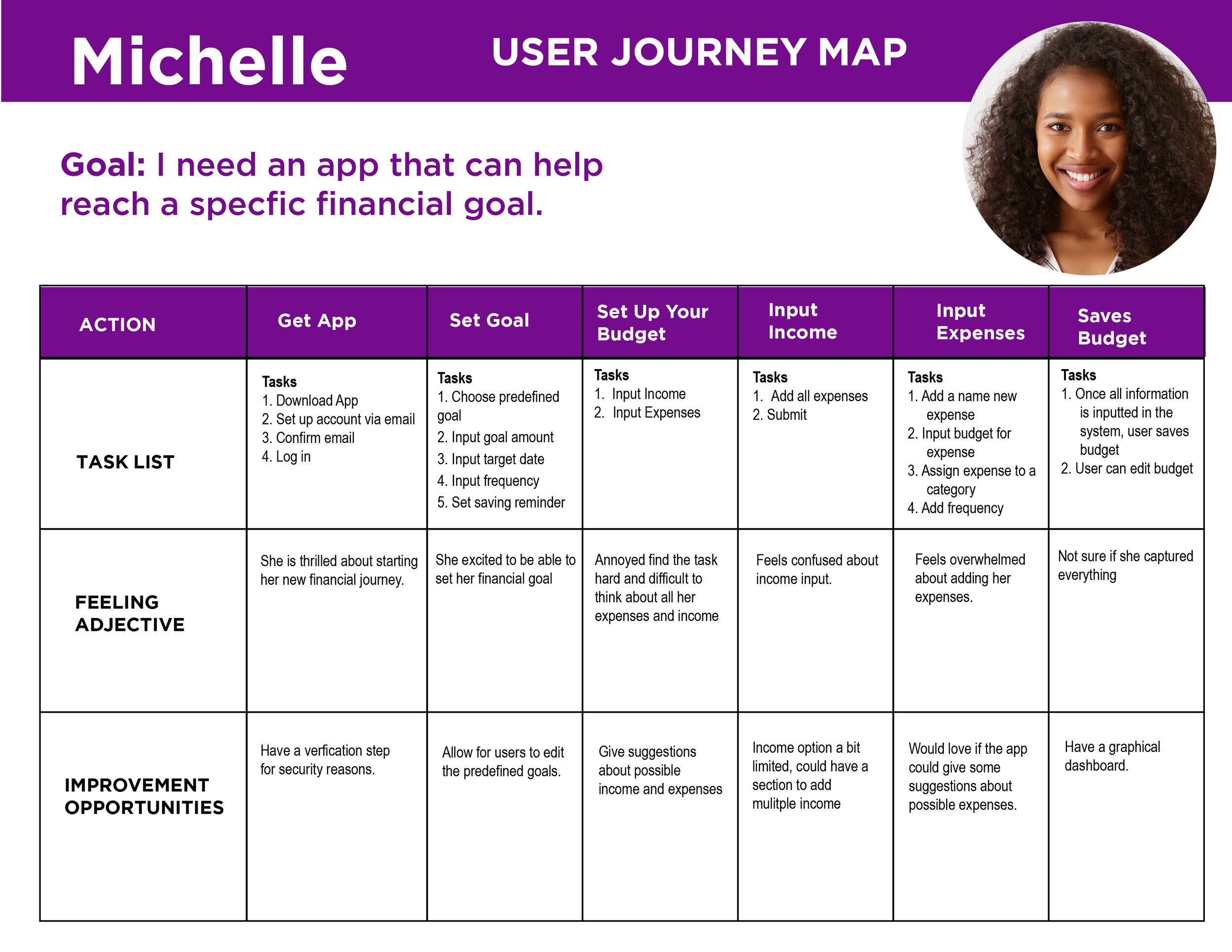
Personas - Building empathy
Using the qualitative data from interviews and survey results, we defined the two target group profiles: Michelle (Marketing Officer, 28), Martin (Software Developer, 38), to better empathize with the user groups and prioritize goals according to their needs.

Problem Statement
Michelle is a full time Marketing Officer, who needs an app that will help her budget in order to save, because she wants to be able to purchase her first car.

Problem Statement
Martin is a busy Software Developer, who needs an app that will help him create a budget and track his expenses, because he is not sure how to create one, and he cannot account for his spending habits.

The goal is to understand the user journey of how the user would set up their budget.
The goal is to understand the user journey of how the user would set up a financial goal.
Ideation
Based on the user research, we brainstormed the main design requirements of the app. The app must allow the user to:
Track their expenses
Save towards a goal
Have information about finances
We created sketches based on these requirements, thinking of how the user would navigate to complete a task/goal. We came up with 5 key Input and output task.
Outputs:
Profile user set up: to send personalized communication via email and to personalize user profile.
Input Information: to track user spending habits. The system will output a monthly graph reports of user spending habits.
Notification of goals. If the user reached their financial goal, they will receive a notification personalized pop up with an excited emoji. They will be rewarded with points and a reward program such as a gift certificate or cash.
Check up reminders: Will hold users accountable by keep them on track of their goals. At this point the user can adjust their spending expenses, if necessary.
Reports - Adding unexpected expenses or income will rebalance the outputs of graph and recalculate the financial goal of the user.
Inputs:
Task: Profile Set Up: User needs to create a user profile by entering name and email address via sign up or sign in by typing into the specific fields.
Frequency - once or as needed.
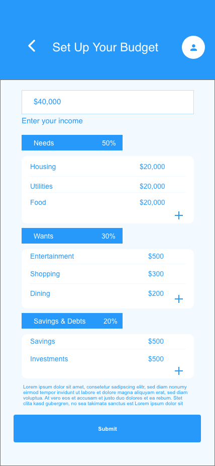
Task: “Input - Collect Information”: Input ongoing income and expenses via structured form and free text.
Frequency - once a month.
Task: “Set achievement goals”: User sets specific financial goals via structured forms and free text. The user needs to meet deadlines to achieve this financial goal.
Frequency: once or as needed.
Task: “Set check-up reminders”: User needs to set weekly reminders to check their spending habits. This is input via calendar - User will get alerts reminding them to check
Frequency: Once a week or Once a month
Task: “Add Expenses”: Input one off or unexpected expenses such as visit to restaurants or to the pharmacy, this is done by typing into specific fields.
Frequency: Daily or when needed.
Initial Sketch of one of the main design requirements.


Brainstorming user flow.
Wire-framing, Prototyping & Usability-Testing
With low-fidelity paper prototypes, the planned syllabus and the general structure of the application could easily be tested in usability tests. Without much effort, adjustments could be made before going into the much more costly digital implementation.
Paper Wireframes
We created paper wireframes with our ideas, the goal and went straight into usability testing.

Sketched Paper wireframes.

We created user inputs and outputs, this helped us to create the list of prompts for our usability testing.
User testing paper wireframes
We did moderated usability testing, giving 4 users a list of prompts. Each session lasted around 15 minutes. After the session we allowed for users to give feedback.

Low-fidelity prototype
Based on the feedback we identified possible solutions and created low-fidelity prototypes.

Problem:
User was confused about how to proceed. No clarity as to how the user should log in.
Too much repetition of the word ‘continue’ button, which made it confusing.
We realized that the continue button was not necessary at this point.
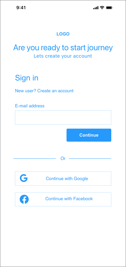
Solution:
Rearrange the layout of the user log in.
Remove the continue button at the bottom

Problem:
Based on observation, user did not click the continue button. The selected their goal and proceeded to the next screen.

Solution:
Remove the continue button. When user selects the goal the system should take them to the next screen.

Problem:
User did not know that they were to input their expenses in the fields.
What should happen is that the user should enter their income and the system based on their income, the system would populate the defined files. So the issue was with the design.
Solution:
Redesign of the page just to have “Enter your Income” field with a small instruction, telling the user why they need to input their income, they next screen will populate the predefined expenses.

Problem:
No buttons to add income or Expenses. User was not sure what to do here, and some of the fields to them did not make sense.
Solution:
Add button to include additions to income.
Final Designs
We developed final designs in keeping with the design requirements, and based on our user feedback.

Onboarding for user.

Home page addressing the challenge:
Goals
Tracking and adding expenses
Financial tips

User flow for budget set up
User flow

Results and takeaways
This was my first UX project and it was a bit challenging as it was the first time I ever did something that was so detailed and extensive. It is a learning process for me and I am glad I got the opportunity to work on this project. There is still a lot more to explore with FreshBread, and we will be making improvements to have better user experience.
Learnings
Do not focus on too much details
Earlier in my journey, I spent a lot of time the UI aspect. What I realized is that I needed to pay more attention to the user flow and how the user can easily interact with the app.
Research on inclusiveness
During my journey designing FreshBread, I did a lot of reading and found that more designers are designing for inclusivity. I found it to be very interesting aspect of design and I will be adding some changes to my design in the future to include elements for the visual impaired. It is an element that I will be researching on.
User testing doesn't end after development.
Design is a constant iteration of improving the experience for the end user. We have been getting feedback on the app and will be incorporating them in our designs for future use.
Involve engineering upfront.
This helps to reduce any rework later on as an understanding of the technical limitations upfront will help to inform your design strategy. We made this mistake earlier in the design phase.